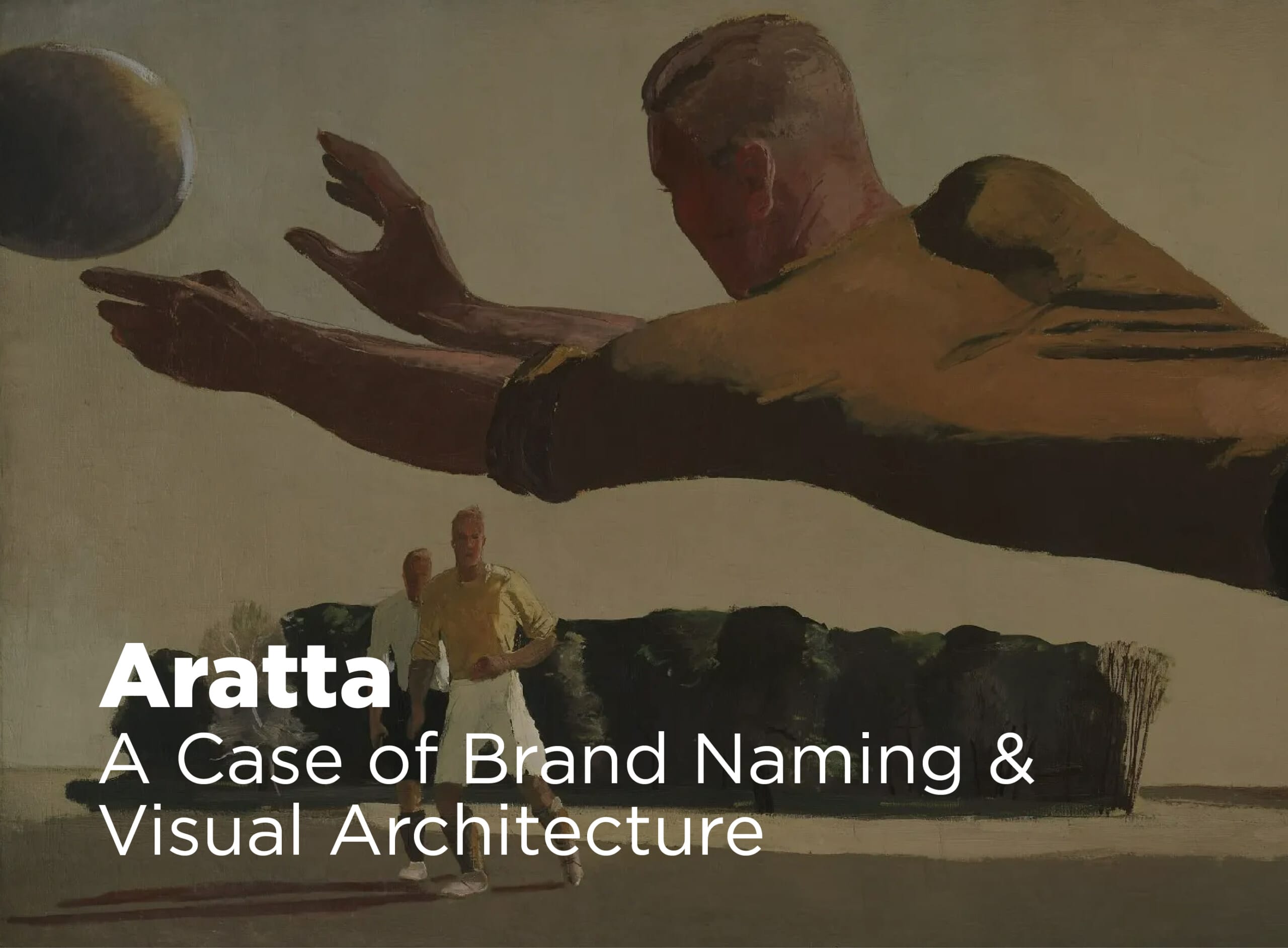
Overview
In 2025, the founders of Champion NGO approached AxelMondrian with the vision of creating a brand that would increase interest in youth football, stand out through its uniqueness and distinction, and inspire young people to become part of a football club. Through in-depth research and long-term strategic development, Aratta was created — a brand defined by its historically rooted name and abstract visual identity, expressing leadership, strength, and timeless relevance.

Aratta Word Etymology: A Name of Heritage and Strength
Aratta is regarded as one of the earliest known state formations, renowned in ancient tradition for its strength, resilience, and perceived invincibility. Aratta is remembered as a land of exceptional prosperity and mastery, rich in the precious resources that shaped early civilizations. But beyond its riches, Aratta embodied something far greater: an unbreakable spirit, the will to overcome challenges, and the ability to transform potential into lasting achievement. Football, like the legendary land, requires determination, teamwork, and the courage to overcome obstacles. Guided by the power of ancient legacy, Aratta connects the greatness of the past with aspirations for the future. It symbolizes power, perseverance, and timeless values, reminding us that true success is not only about winning games, but about building character, heritage, and a legacy for generations to come.
Aratta is a Ruler by design
It does not seek authority for its own sake, but earns it through discipline, vision, and responsibility. Where others follow trends, Aratta sets standards not through force, but through consistency, excellence, and an unwavering commitment to leadership. It operates with confidence and clarity, projecting strength not through
noise, but through presence, control, and purpose. Aratta believes that leadership is built on structure, trust, and long-term thinking. Its approach is firm yet inspiring, demanding high performance while nurturing potential. Every decision reflects a sense of order, ambition, and accountability, reinforcing its role as a guiding force in youth football. Beyond performance, Aratta shapes character. Its leadership extends to mentoring, culture-building, and community impact. Driven by high standards and a future-oriented mindset, Aratta is not only developing skilled players, but forming confident leaders — individuals prepared to compete, influence, and set the pace for what comes next.

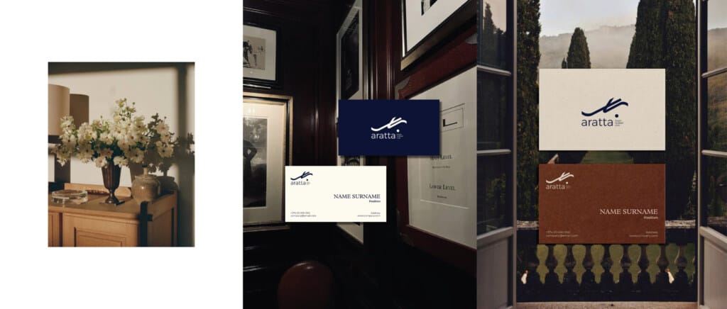
Story Behind the Brand Logo
Aratta brand logo is inspired by the movement and precision of football players striking the ball. When a player leans on one foot and positions the other behind to generate power and speed, the body forms a dynamic structure – harmonizing balance and mobility.
This motion was famously performed by one of the legends of football Zinedine Zidane, which shaped the reinterpretation of his movement into Aratta logo. The logo itself is composed of two lines and a dot, abstractly representing the mechanics of the strike. The first line reflects the merge of the player’s body with the support leg, grounding strength and balance. The second line represents the swinging foot as it prepares to hit the ball, channeling motion and momentum. Finally, the ball is abstracted into a dot, completing the form and emphasizing precision and focus. Through this design, Aratta logo captures power, agility, and the perfect fusion of technique and intent, reflecting both the spirit of football and the values of the brand.


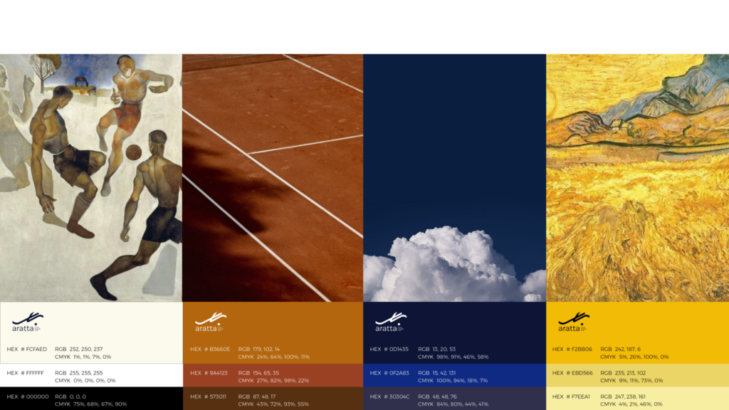
The Expression of Colour in Aratta
Aratta’s color palette reflects leadership, ambition, and a strong winning mentality. The colors communicate confidence, discipline, and prestige, reinforcing Aratta’s position as a standard-setter in youth football. The palette balances energy with professionalism, symbolizing both the passion of young athletes and the structure needed to develop future champions. It creates a bold, authoritative, and inspiring visual identity that expresses excellence, trust, and long-term vision.